
THINGS SHOULDN’T BE SO HARD
Book Cover Design
OPPORTUNITY: Create a book cover to represent a local Alabama artist’s journey and practice.
RESPONSE: The book and cover were designed for Alabama Artist and UAB faculty member Doug Baulos. The client was looking for a design that acted as a workbook that users would feel comfortable adding writing and collaging to the pages. All pages were B&W with plenty of space for working to add to the invitation to personalize the workbook.
Awarded AIGA 2022 / 50 Books / 50 Covers.

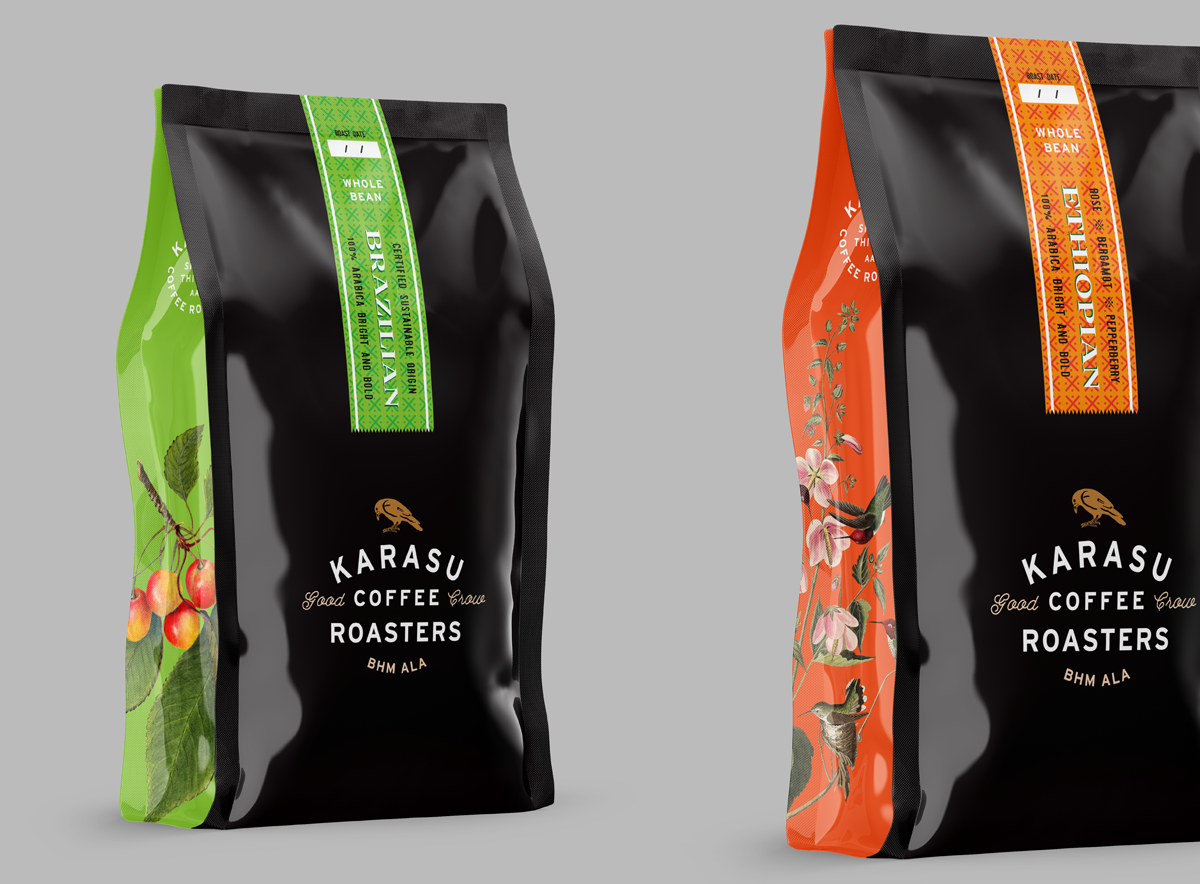
KARASU COFFEE ROASTERS
Birmingham, ALA
OPPORTUNITY: Karasu Coffee Roasters is a small batch, handcrafted coffee roasting company in Birmingham, Alabama.
RESPONSE: Karasu is a small start-up coffee roasting enterprise looking for a high-touch design centric brand/logo. The primary stake holder spends many weeks a year in japan; and has an elevated sensibility for marketing, branding and story-telling. They were looking for work that was clean, simple, smart, sophisticated and felt thoughtful and eco-responsible. Karasu means “crow” in Japanese, so having a crow figure was central to the exploration.
Custom hand-drawn calligraphy was explored, as well as very simple typographic directions.


VERDANT LOGO BRAND IDENTITY
Southeastern, US
OPPORTUNITY: VERDANT is a non-profit fine arts organization that distributes funding and support to non-traditional and under-served arts in the Southeastern US.
RESPONSE: VERDANT is a funding arm of the Warhol Foundation. The organization was looking for an identity that was sophisticated, conceptual and that would appeal to ALT, LGBTQ and other under-served artists in the region. The client asked that the logo/identity not feel corporate but rather asked for the creation of an identity that would align itself with regional artists who would be attracted to an alternative aesthetic. The brand keywords were knotty, knarly, Art Practice (journey), accessible, nature, distinct. Themes included: Wild Alabama Persimmon, Alabama Rock Garden Highway, and the Cabinet of Curiosity. An overarching concept that this should look like growth was described by the client.

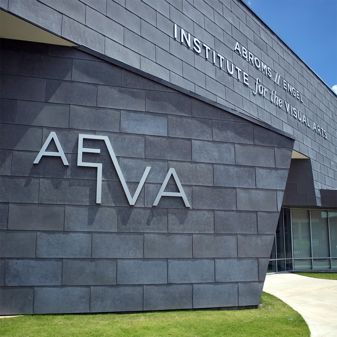
AEIVA BRANDING & SIGNAGE
Birmingham, AL
OPPORTUNITY: Create a logo/brand for a new fine arts institute located on the UAB campus in downtown Birmingham.
RESPONSE: The Abroms-Engel Institute for the Visual Arts was design by architect Randall Stout, specifically to break the university rule of a red brick building. The zinc on glass aesthetic immediately tells the community that this place is different, modern and new. The asymmetrical placement of the type references the building’s cantilever canopy. The connecting strokes between the E and V and I reinforce the structure and create an exciting balance between elements.


Survey The Landscape:
Arts Integration at Research Universtities


FORSTAL BRANDING & SIGNAGE
Birmingham, AL
OPPORTUNITY: Create a logo, branding and signage for a Birmingham art materials store.
RESPONSE: Forstal Fine Art is a Birmingham icon that has supplied fine arts materials, advice and community classes and support for almost 15 years. The logo uses the simplicity of a round dot, the legacy Forstal red color and a simple type treatment to reference the confidence of high quality materials and expert advice that is a hallmark of Phillip and Annette's family run store. In 2017, Forstal moved into their new location in the heart of Birmingham’s vibrant downtown art scene. The logo was reimagined as a 3D sign placed on the new 20th street location. The bright red color, simple design and clean execution are a perfect balance for the historic building.


WARHOL SOAP BOX INVITE
Birmingham, AL
OPPORTUNITY: Create an interesting invitation that reference the Warhol aesthetic, and activates the user for the first major Warhol show in the southeast.
RESPONSE: The invitation comes through the mail flat in an envelope. Once the recipient opens the envelope they are confronted with a flat box that they then get to make themselves. Simple instructions guide them through the process of constructing "their very own" Warhol, referencing Andy's ideas on consumerism and fame. "Everyone can have a Warhol." The invitation takes the form of the famous Warhol BRILLO boxes. Exhibition details, dates, times and locations are all presented as part of the box design.
This design won a Silver ADDY in 2015.


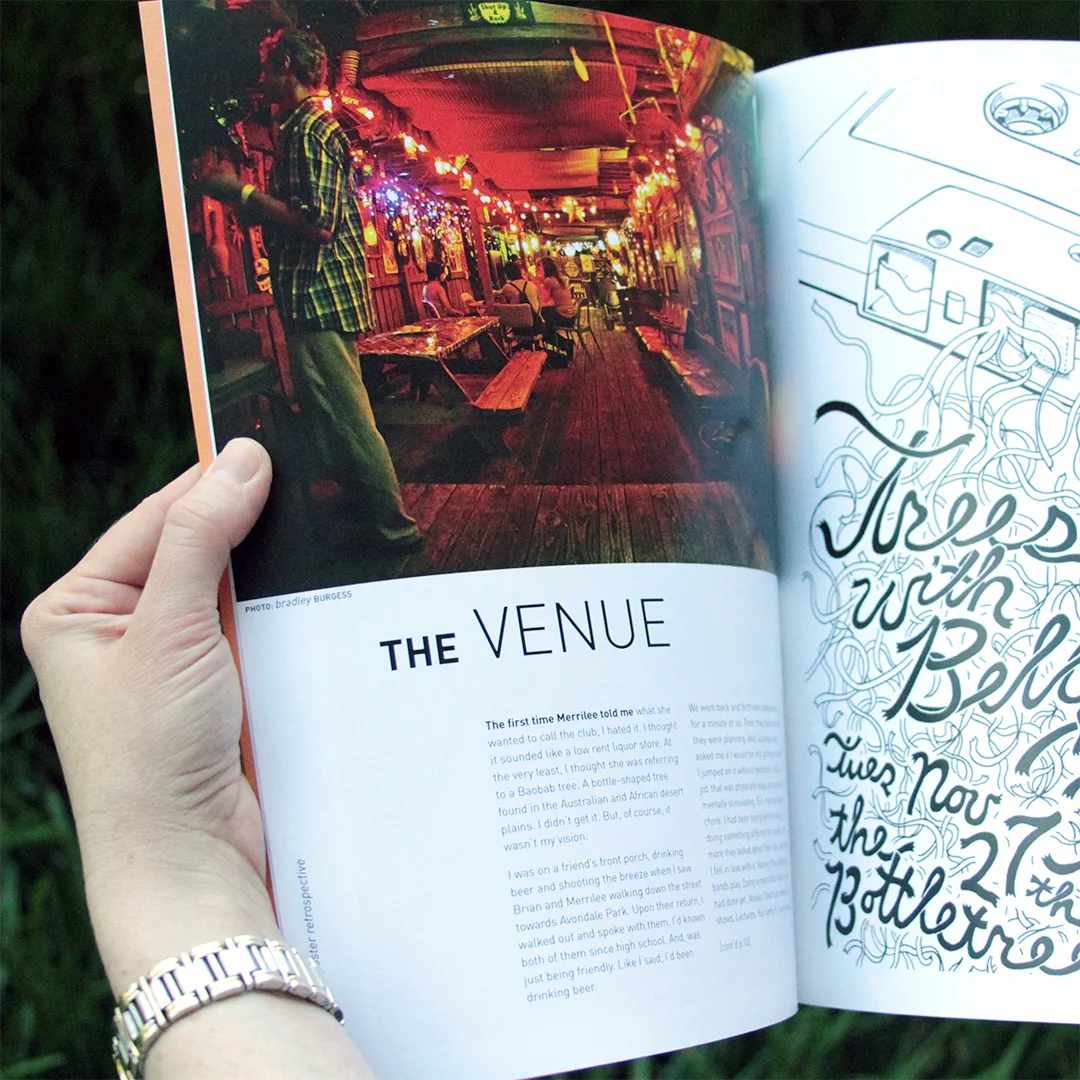
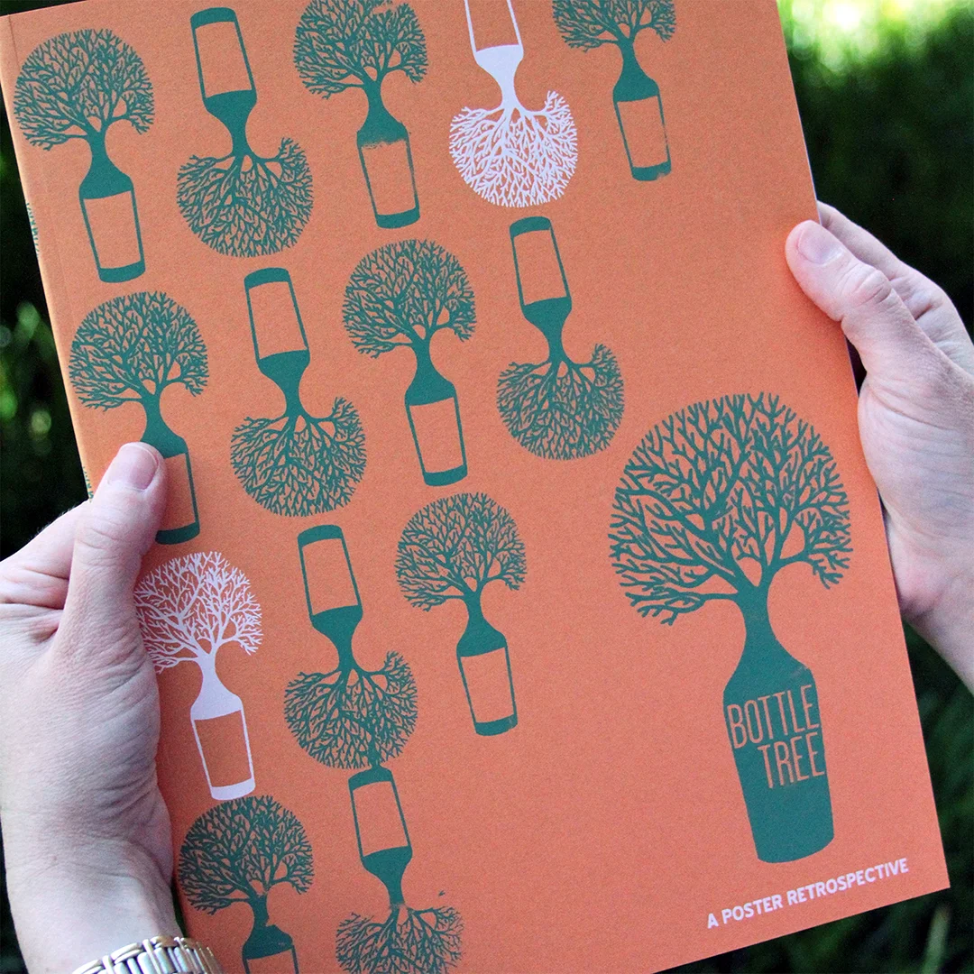
BOTTLETREE POSTER CATALOG
IN COLLABORATION WITH YELLOWHAMMER CREATIVE
OPPORTUNITY: Bottletree is a local, iconic Birmingham venue celebrating seven years in the community with a poster retrospective and printed catalog. The catalog also serves as an archive that includes almost all of the posters created for past performances.
RESPONSE: The exhibition and catalog celebrate the venue’s history of shaping live performance in Birmingham and supporting local artists and designers with an opportunity for poster design.
I wanted the catalog to record the exhibition in a way that supported the work without overpowering the vision of many local artists. A simple sans serif typeface, clean white pages and basic grid layout display the work in an interesting yet clean manner.
To reference the unique, home-spun history of the venue, screen printed covers were hand printed in 5 different colors. The limited run of 500 books sold out before the end of the exhibition.


FACULTY EXHIBITION CATALOG
Birmingham, AL
OPPORTUNITY: Creation of an exhibition catalog to showcase the current work of UAB’s Art Faculty.
RESPONSE: As a new faculty member it was important to me to be able to create a catalog that expressed my voice and vision as a designer. I wanted the catalog to reflect the sophistication and quality of work that the faculty were creating in the department.
UAB is a research one institution located in Alabama’s largest urban area which has been ranked one of the most diverse campuses in the US. Because the medical school and research hospitals are world renown it was even more important to create a catalog that equaled the expectations of the school and the quality of research being done in other areas of the university.
The catalog uses matte paper and a blind embossing to create “hand” appeal. Text is set to create a heightened sense of hierarchy, with large borders, and a generous amount of white space. This is a small book but allowing images to bleed helps to break the borders of the page. Bright process colors give the piece a modern, sophisticated feeling.
This catalog won a SILVER ADDY for the arts and sciences category in 2011.


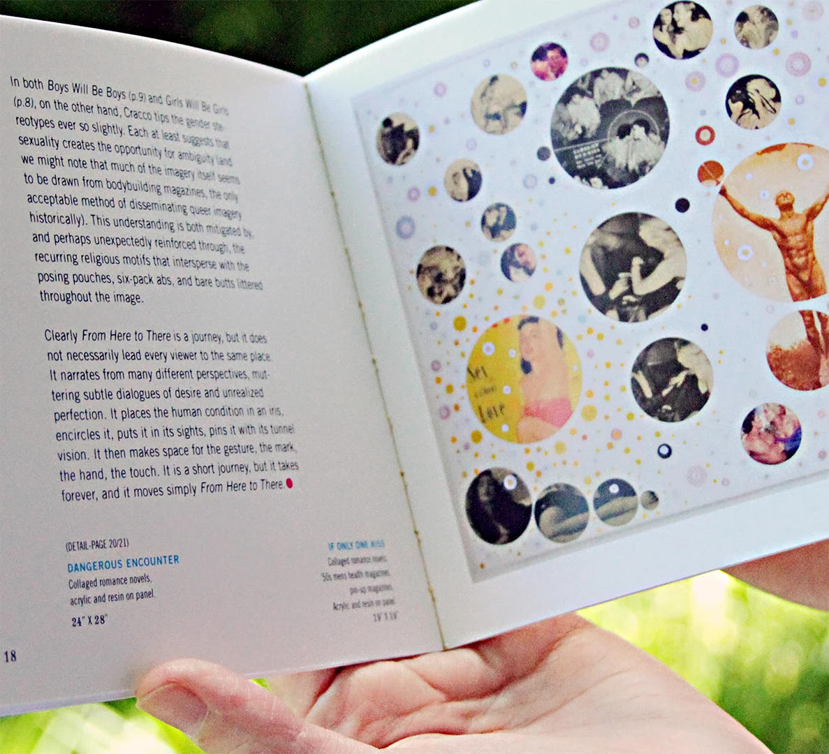
DEREK CRACCO EXHIBITION CATALOG
Birmingham, AL
OPPORTUNITY: Creation of an exhibition catalog to showcase the work of artist Derek Cracco.
RESPONSE: The catalog uses the polka-dot aesthetic of the artists work as a design device. The square shape of the catalog is taken from the proportions of the dot and the diminutive size minimized the printing budget. This catalog won a SILVER ADDY for the arts and sciences category in 2011.